Two different takes today on how the world of development in 2014 clashes with existing cities and human needs:
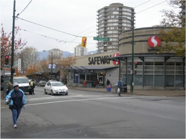
First, Brent Toderian wades back into the troubled waters of tower design. In a long piece worth reading from beginning to end, he defends tall residential towers (as he did while he was Chief Planner for the city of Vancouver) but also pleads for better design:
For my part, I try to avoid what I consider "scale dogma." I am neither inherently for tall buildings, nor against them. There is no height that will automatically consign me or my fellow urbanists to Hell. There are, however, good and bad design choices.
Although I have nothing against tall towers per se, there are few things I dislike more than a tall tower in a dumb place, or a badly designed tall building – of which there are many. In fact, many of the cities I've worked with likely have a dislike of tall buildings stemming from one (or some) they've approved in the past that was just plain awful. I call this the “Montparnasse Effect,” named after the tower in Paris that so infuriated Parisians. I often note that “if that tower was what I thought I’d be getting, I’d be against tall towers too!”
...
The beauty of our block and building is that the design provides an option for both of us – both ground people and sky people. Telling either one of us that we’re wrong, that we're suffering socially as a result of our choice, would be ridiculous to either of us. We both made our choice based on what we value most, but what's really important is that we’re both living downtown in a highly urban, mixed-use, walkable, transit-friendly, infrastructure-efficient and low-carbon footprint context.
Whatever reason people choose to live in higher densities, I'm glad they're making that choice. It’s part of making higher density more attractive than the alternatives, which we know have serious societal implications and costs.
Admittedly I am much more in the Jan Gehl/Leon Krier camp on this, but Toderian makes a series of good points. Also, it's a very practical, realpolitik (as they used to say) approach.
Next up.. a controversy in Paris regarding the Samaritaine department store, and a rebuild that's proposed. Feargus O'Sullivan writes:
LVMH
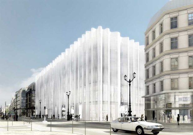
The French capital’s strict historic building preservation has come under fire this month, after a major revamp of a Parisian landmark was shot down by the courts. The vast Samaritaine department store, looming over the Pont Neuf since 1869, has been shut for an extreme makeover since 2005, one that planned to replace three of its sandstone outer walls with an opaque glass shell. The rebuild’s lovers saw this proposed veil as "undulating, diaphanous." For its haters, however, it was just a "giant shower curtain."
...
Arguments about this issue have another undercurrent: a sense that Paris’ place as a great world city may be slipping away. This month, aPricewaterhouseCoopers survey placed Paris for the first time outside the top fivein a survey of the world’s most attractive cities, pushed out by a perceived fall in its economic power and modest growth. Someone living in PWC’s top-placed city – London – might well question the value judgments that have granted it a supposed attractiveness surpassing all others, but there’s no denying that such pronouncements knock Parisian confidence. Maybe the attitude that saw the Samaritaine’s plans dismissed shows that the city hasn’t truly woken up to the 21st century after all.
The problem with this argument comes when you look at the plan’s actual drawings. This was no groundbreaking new structure. It was a banal and rather familiar project that involved skinning the old building and placing it in a sort of architectural freezer bag. It’s hard how to see it could have been either a break from conservatism or a real adornment to its surroundings. If this was a stick to beat architectural reactionaries with, it was less a bruising rod than a flimsy tickle twig. In fact, the vocal support for the building from the likes of Potzamparc are persuasive in one (unintentional) sense. If this is what a landmark modern building looks like in contemporary Parisian terms, the city has indeed been starved of examples of good new architecture for too long.
The problem in my mind is the underlying philosophy and attitude. So many architects, and certainly the starchitects that get all the press, have an aesthetic agenda that is hell-bent on innovation and experimentation, regardless of the costs. This particular battle is yet one more around the globe, where people are rightfully asking questions about contemporary designs.
Paris is in my opinion the best big metro in the world for those that actually care about the life and happiness of human beings. Those rankings are frankly silly and come and go like the tides. Parisians are wise to step back and ask, "what's to become of our city?" And I don't think it's at all wrong to ask, "why does innovative design have to be so ugly and so inhumane?"
If you got value from this post, please consider the following:
- Sign up for my email list
- Like The Messy City Facebook Page
- Follow me on Twitter
- Invite or refer me to come speak
- Check out my urban design services page
- Tell a friend or colleague about this site


