It's a Friday, which must mean it's time to argue about architecture. Here's some recent items from the internets that highlight the ongoing battles in design thinking and theory:
First, David Brussat worries about design direction within the CNU and lashes out at the creeping desire to accept contemporary architecture in New Urbanism:
The New Urbanism is really the old urbanism guided by principles of human scale, residential density, proximity and walkability. Before World War II, cities, towns and villages got built and grew over time with few rules. Builders used forms and practices that had worked well throughout the history of human habitat.
That has changed, of course. Civic evolution was interrupted after the war by an ideological revolution. Tradition was dethroned by modern planning and design, based upon the dubious machine-age idea that honest design looks utilitarian and that beauty is expendable.
So by now, what is new in cities and towns is believed by most people to be worse than what it replaced. An entire movement, historic preservation, arose to defend old places against modern architecture.
...
New Urbanists be warned: The modernists are on the march. They have purged preservation of its founding fear that traditional neighborhoods are under assault. They have staged administrative coups at about half of the few remaining architecture departments that feature a classical curriculum (the University of Portugal at Viseu, the University of Oregon, the Prince’s Foundation, in London). Yes, there are only three or four architecture programs with a classical curriculum left in the world.
...
Modernism is like a virus that uses subtle techniques to infect its host and achieve brutal results. Modernism does not want to befriend tradition. New Urbanism has long had the virus in its blood. Now, in Buffalo, it has broken out in a rash. Watch out! Not pretty!
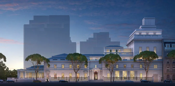
Speaking of tradition, the Frick Collection shows that you can in fact expand a museum with classical architecture. Yes, despite the howls of many architecture theorists, it is possible to build a new building that looks like the old:
Image by Neoscape, Inc. and the New York Times
Frick officials said the new design, by Davis Brody Bond, the architecture firm behind the interior of the new National September 11 Memorial Museum, was intended to be sensitive to the integrity of one of New York’s beloved historic buildings. It would retain the Beaux-Arts vernacular of the original home and use the same Indiana limestone.
Officials at the Frick are taking a decidedly different approach from those at the Morgan Library & Museum, which is housed in another Beaux-Arts building, but whose new wing, completed in 2006, features a contemporary design of steel and glass.
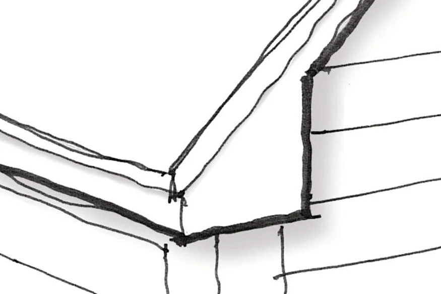
In the "how to do it" world, architect Donald Powers writes in Builder magazine about alternatives to the pervasive "pork chop" eave. Thank God that talented architects like Powers are writing for Builder mag:
The dreaded "pork chop" eave. Drawings by Donald Powers
The pork chop evolved from generations of builders trying to imitate homes with classical entablature and traditional eave construction. But because so much common knowledge about traditional form has been lost over the years, so, too, has the ability of consumers and professionals to discern what looks genuine and what doesn’t.
Pork chop eaves happened because they were efficient and simple. They didn’t stray too far from a traditional solution. A logical builder will say, “It saves work—what’s the problem?” The problem is it looks terrible.
And finally, just for old time's sake, here's a tired old argument straight out of the Bauhaus about architectural design:
If the “Vintage Collection” merely made reference to older building styles but were clearly new builds, it would be a different thing. But there is a huge difference between making reference to an older style versus actually just plain copying an older style. The latter is lazy and opportunistic. Instead of moving architecture forward, it slows and even reverses the creative momentum of the discipline by recreating styles, forms and details that made sense decades ago, but have nothing to do with our current times. Architecture is supposed to be a reflection of what is happening in the world today, the current technology and the current ethos of our culture. When buildings become nothing but bad copies of buildings past, it sullies the entire creative process of designing buildings.
The theme that happens in every architectural critique like this is the zeitgeist. I previously wrote about that fallacy here, and suggested an alternative mindset. Just to remind architects that are so eager to dismiss "vintage" styles - those old styles aren't popular just because of nostalgia. They're popular because they engage us as human beings. You get the feeling that there actually, you know, might be humans involved somewhere and not machines or industry.
If you got value from this post, please consider the following:
- Sign up for my email list
- Like The Messy City Facebook Page
- Follow me on Twitter
- Invite or refer me to come speak
- Check out my urban design services page
- Tell a friend or colleague about this site


